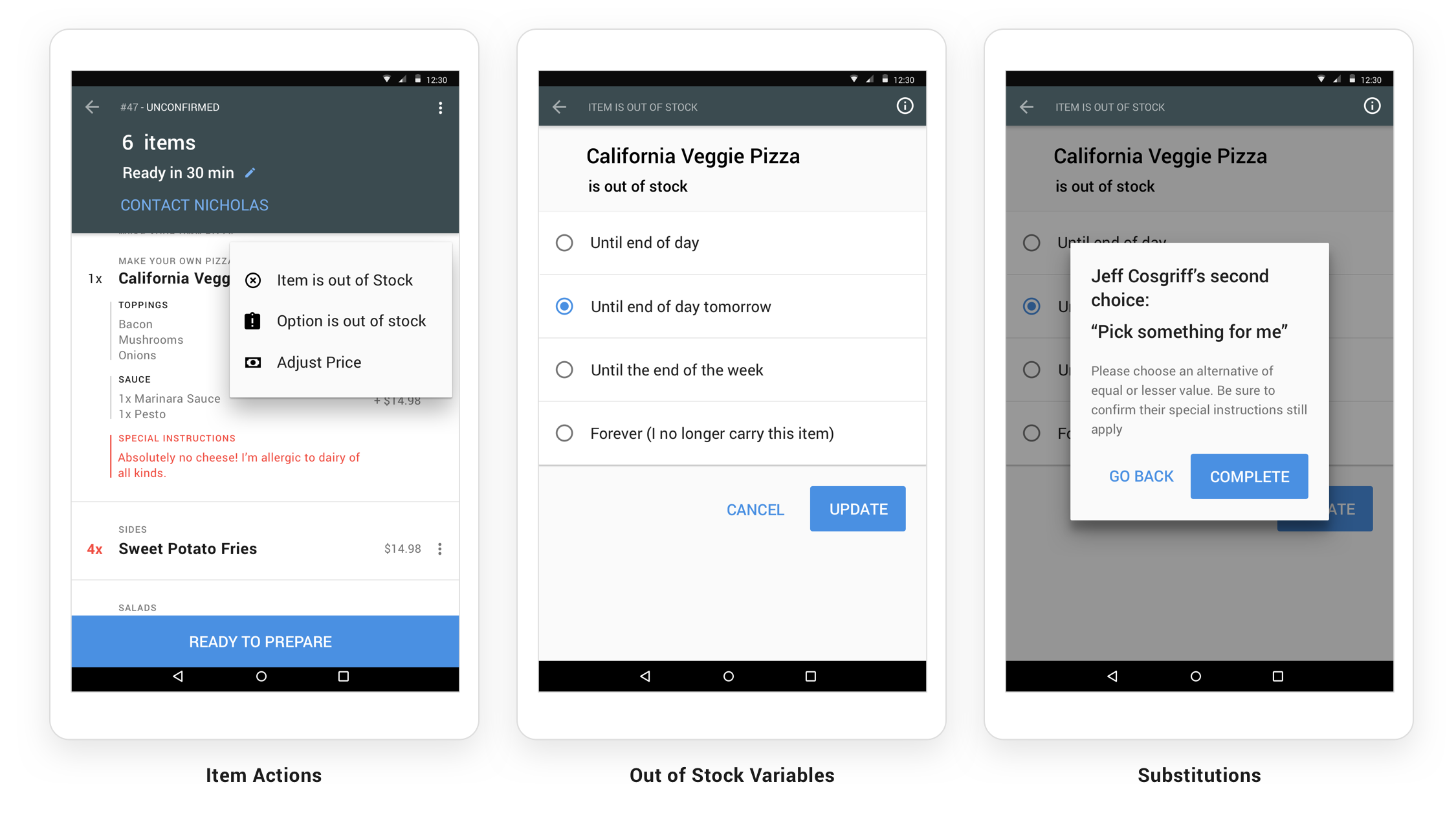
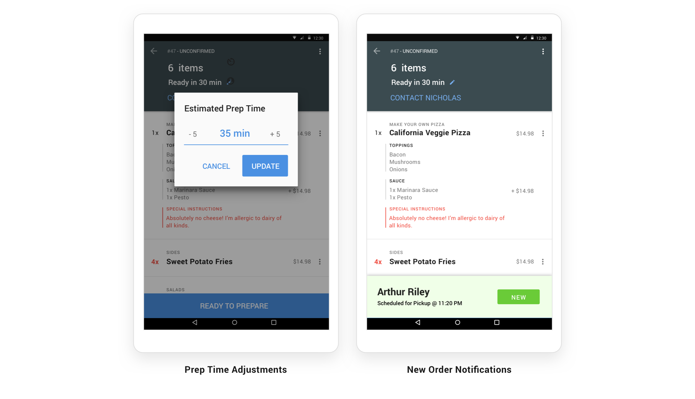
When we designed our Merchant tablet app (for receiving, confirming, and managing incoming delivery orders), we started by visiting different restaurants to see how they managed their front of house/host area. Many of these small businesses had tiny limited spaces cluttered with point of sale systems, landline phones, and even archaic fax machines all vying for their attention. We settled on a inexpensive android tablet design that would 1) accomodate portrait mode to save valuable counter space and 2) use simple typography and colors for no-frills clarity of important details.
Our final design utilized mostly Material Design patterns and emphasized constant in-app support functions to reduce phone calls to both the customer and our internal support team. We also strove for order accuracy through reminders and color highlights.